

food & beverage branding
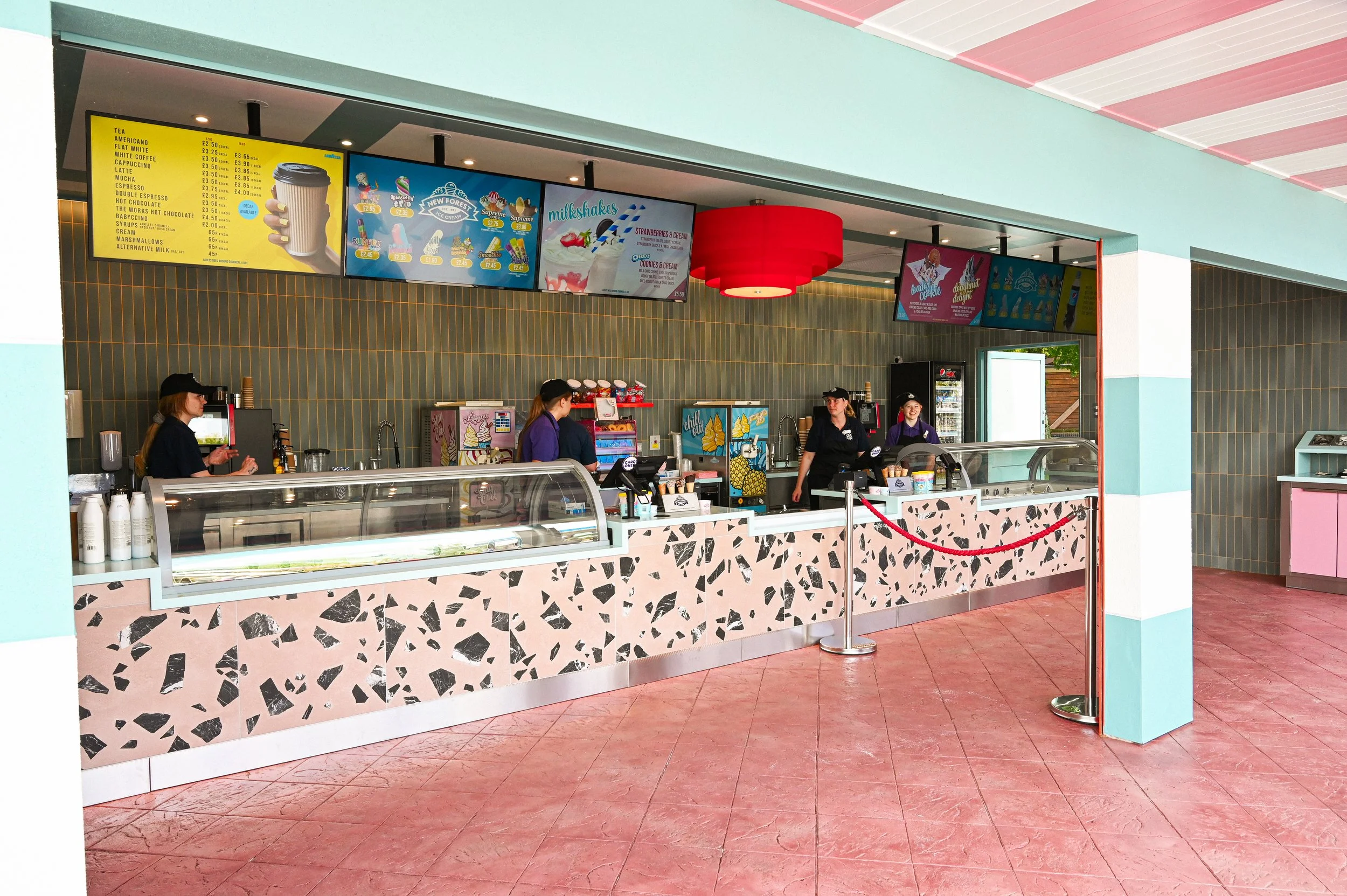
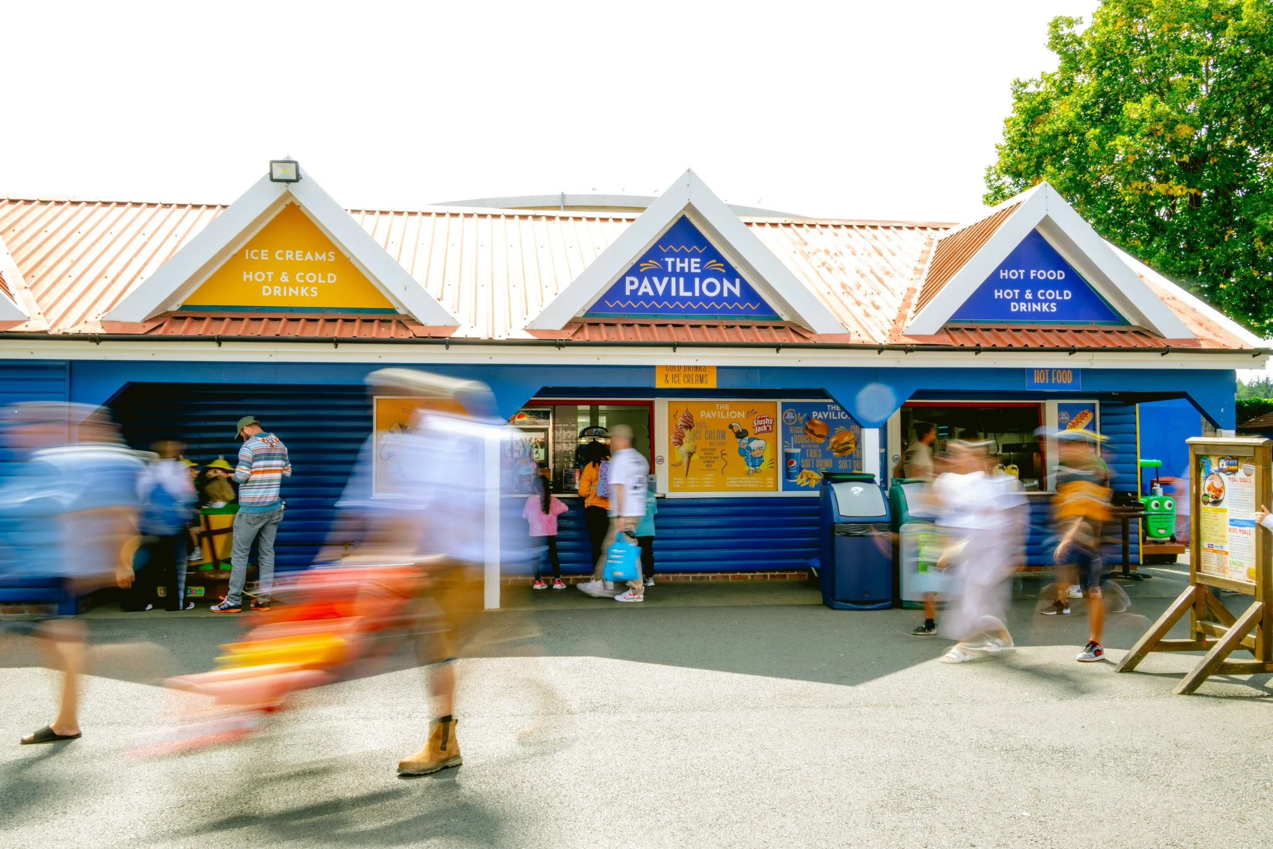
Paultons Park has around 18 food and beverage outlets, ranging from large, family-friendly restaurants to smaller kiosks offering drinks, snacks and specialist treats. With the park continually evolving, I am responsible for ensuring these outlets get regular design development, refreshes and re-themes to ensure they remain visually engaging, relevant and consistent with the wider environment.
the feasting hall & the doughnut forge
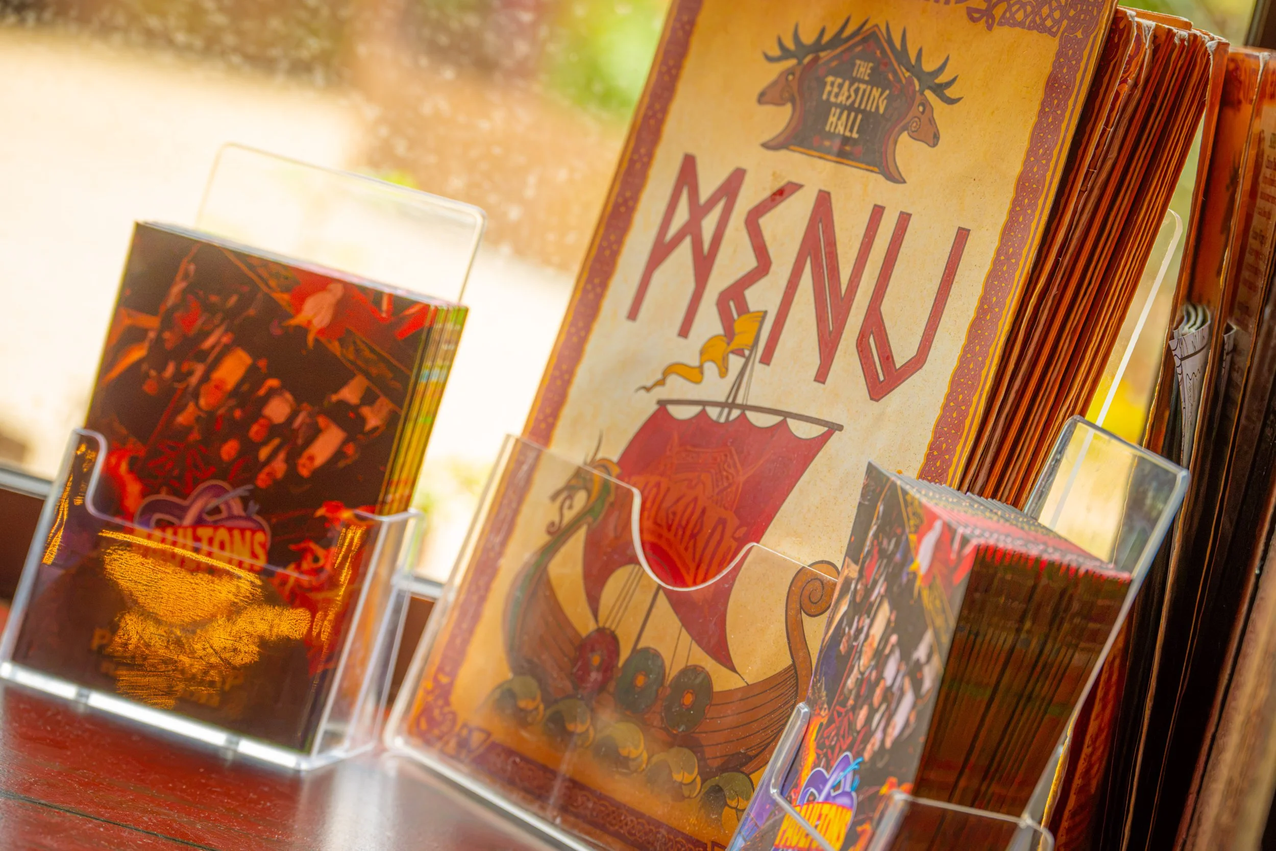
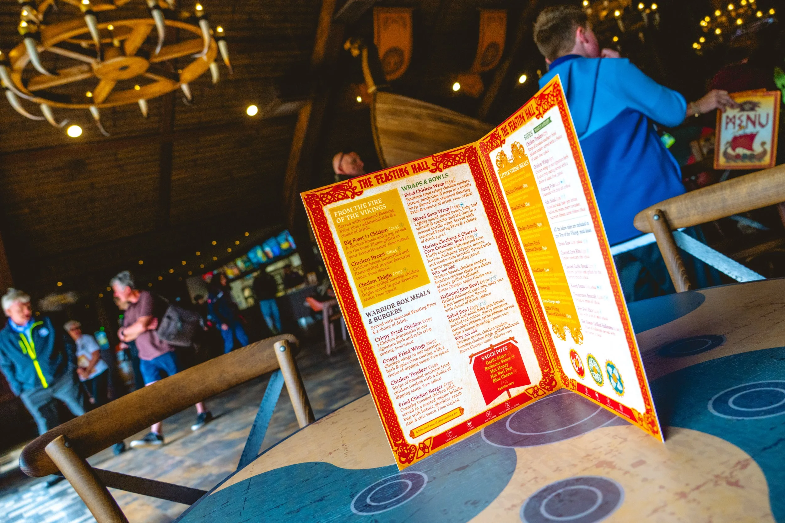
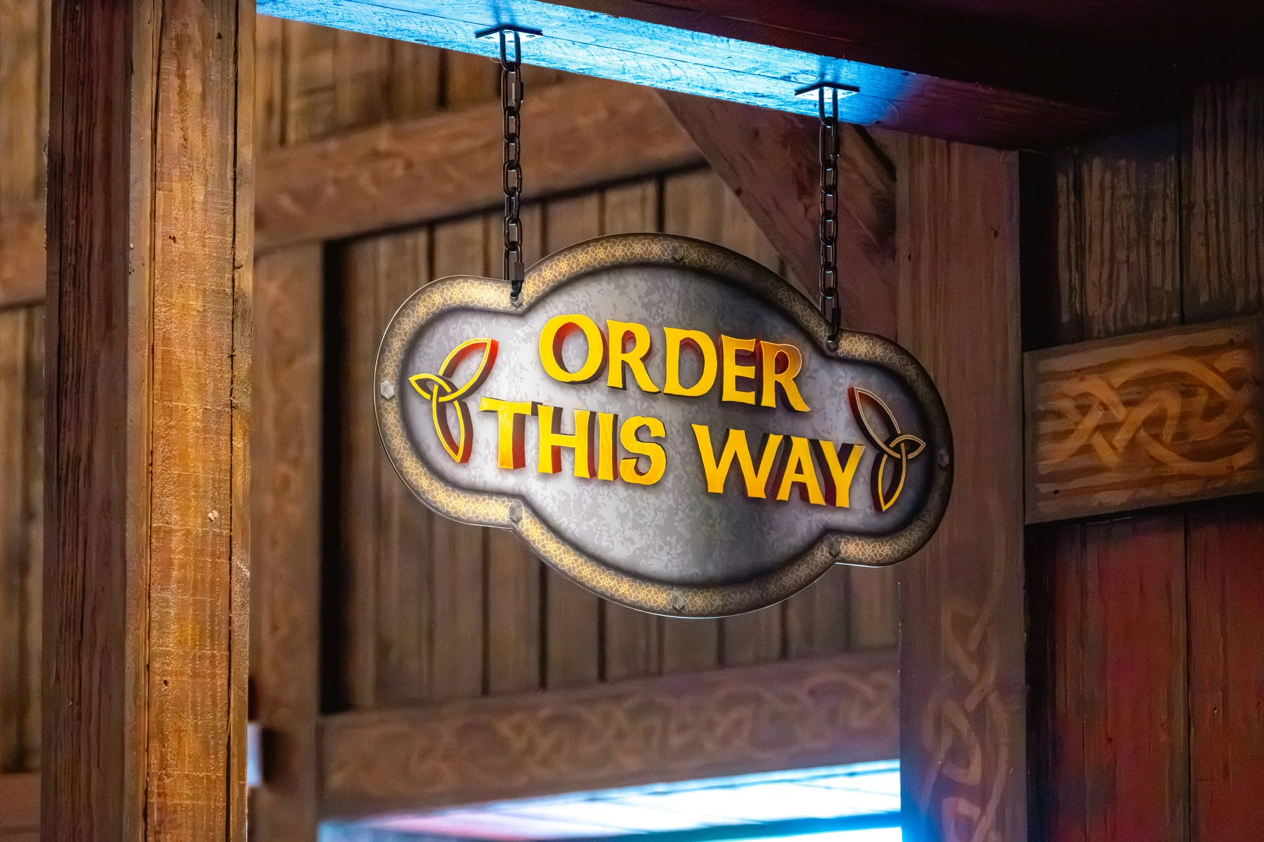
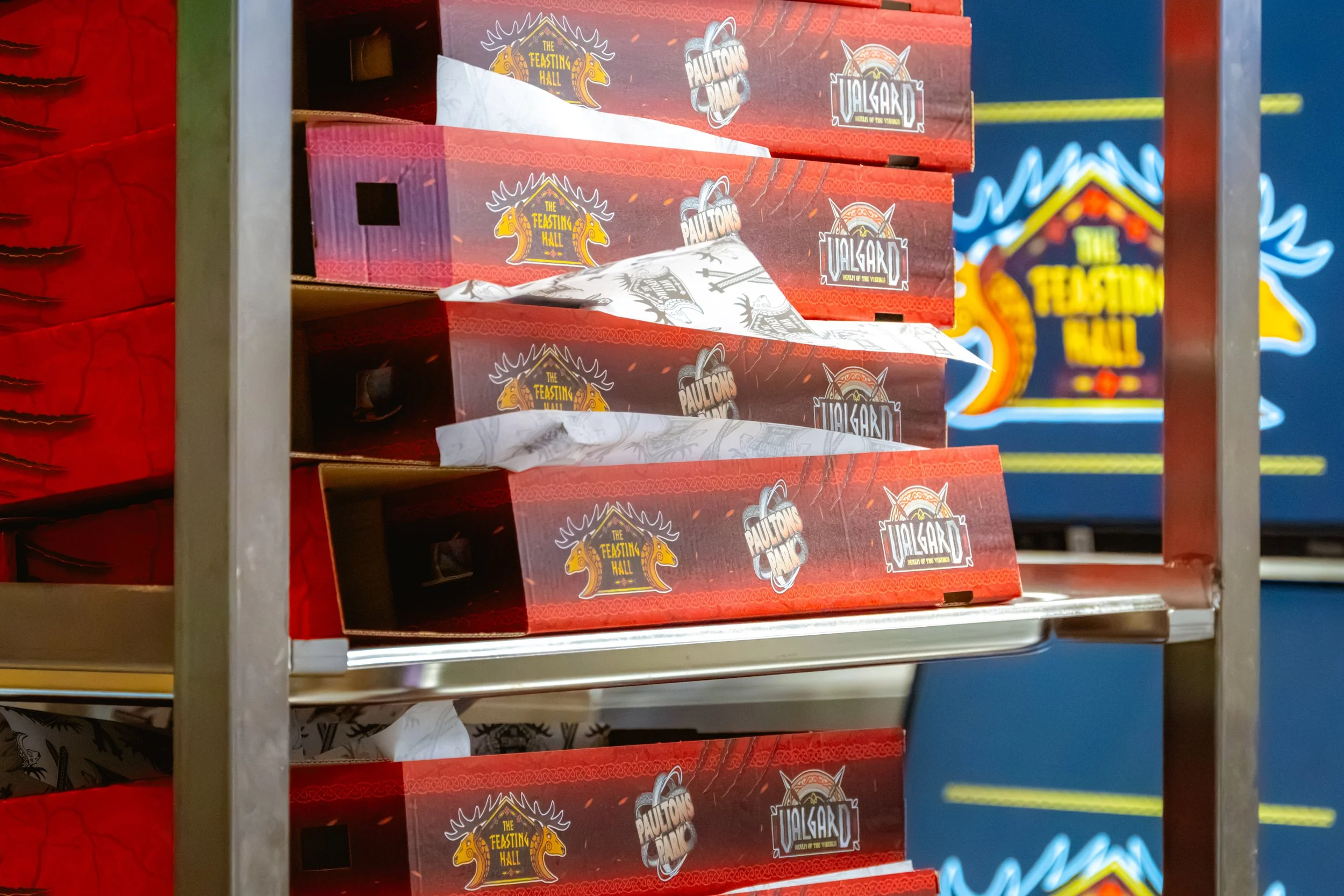
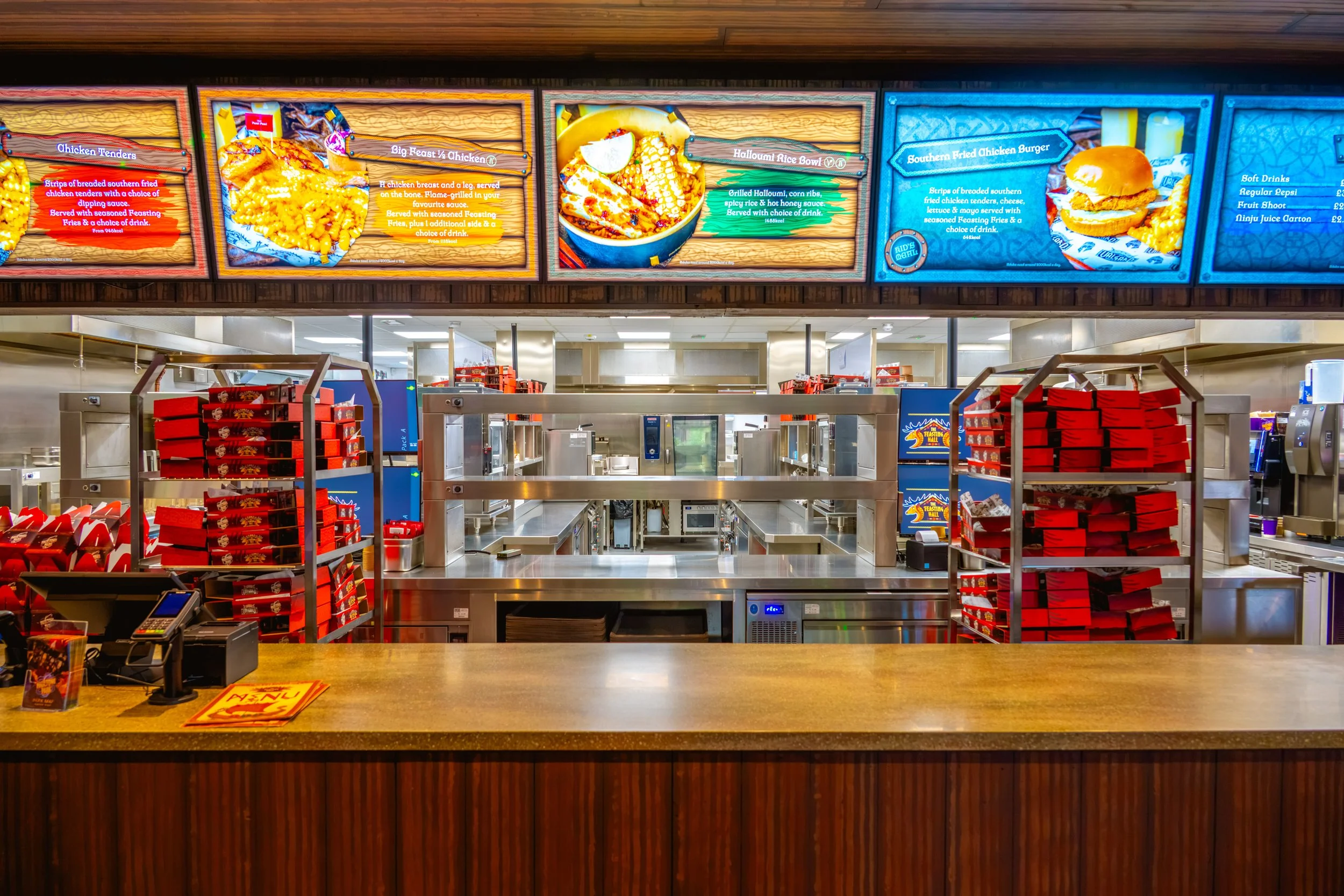
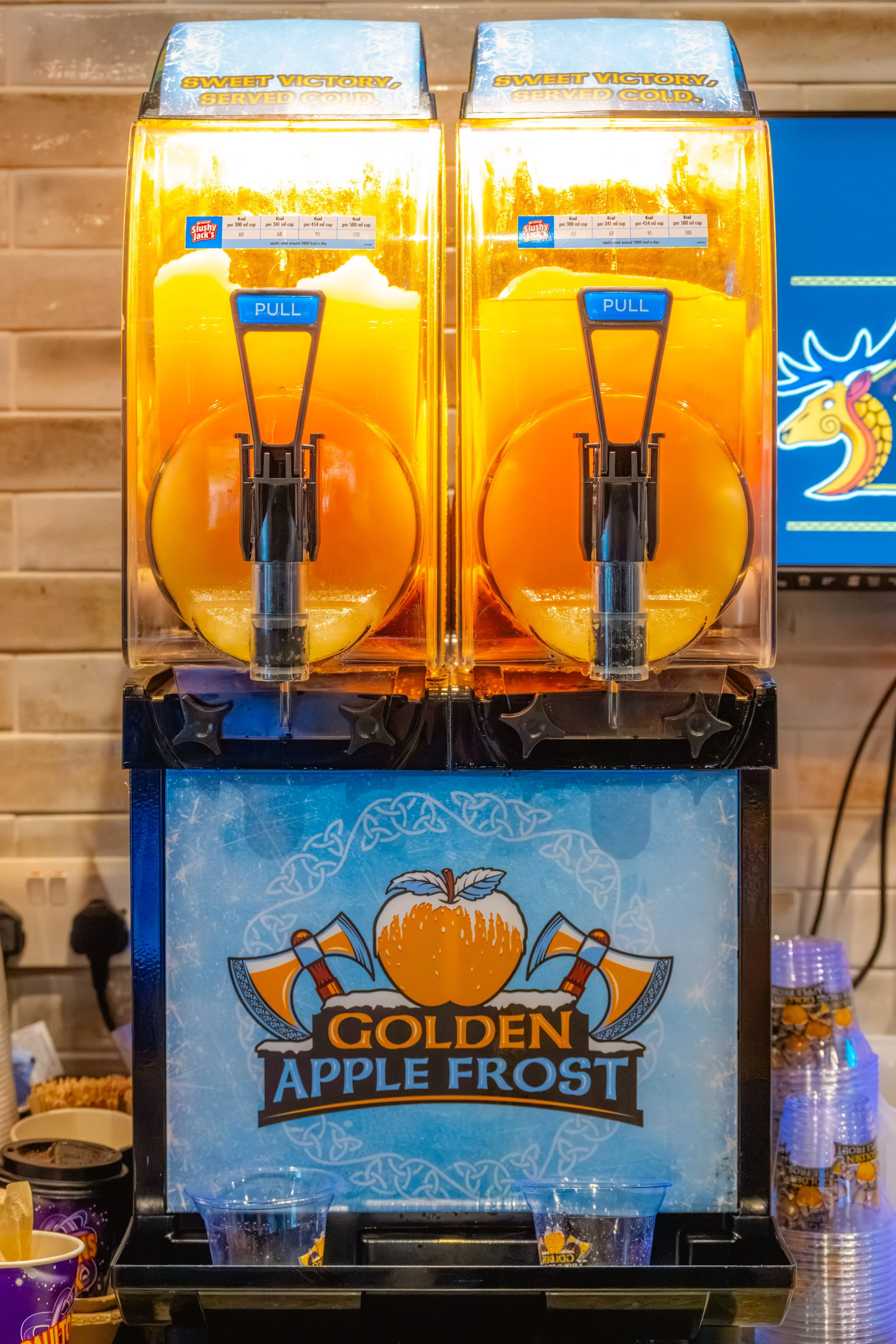
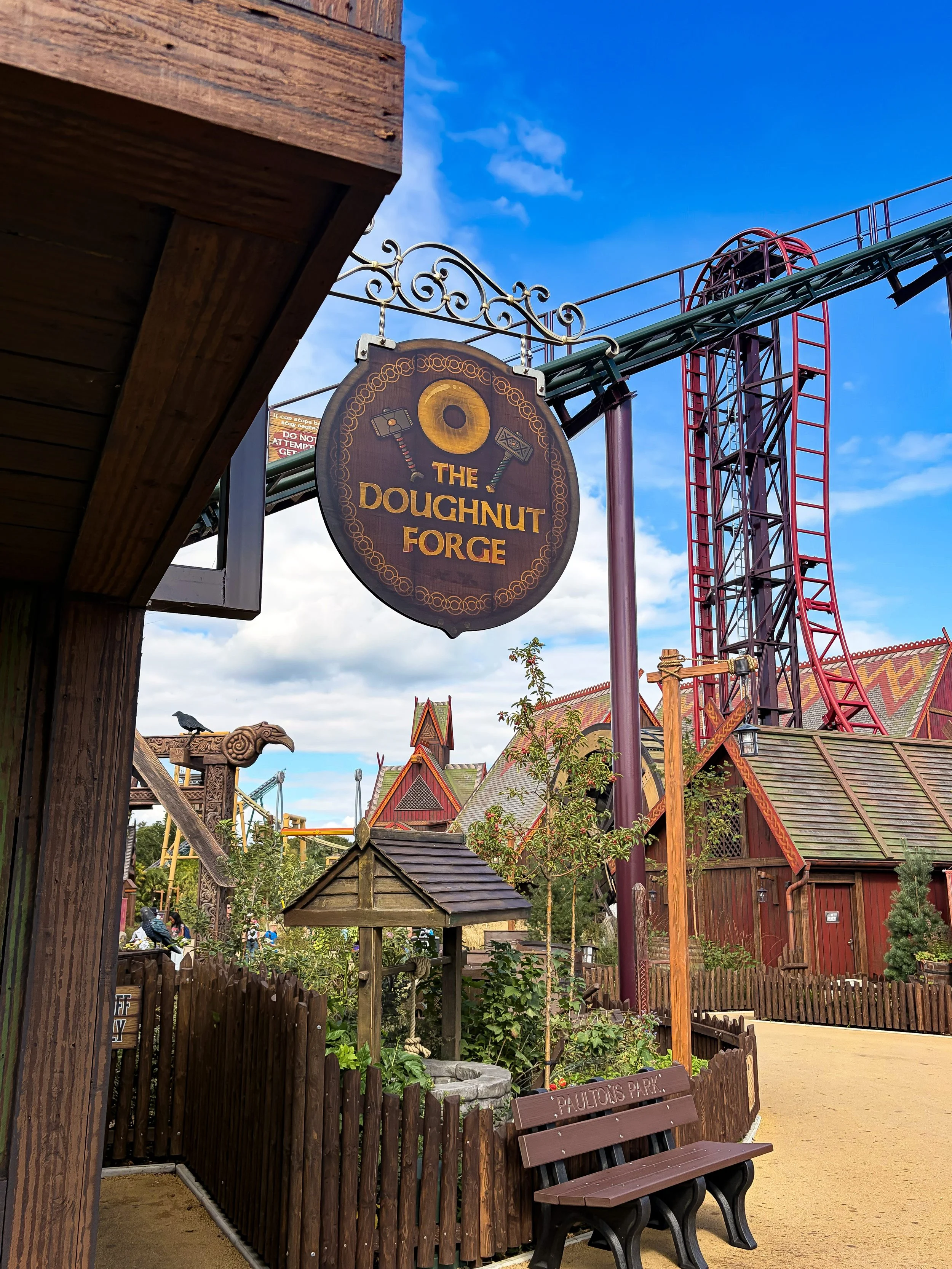
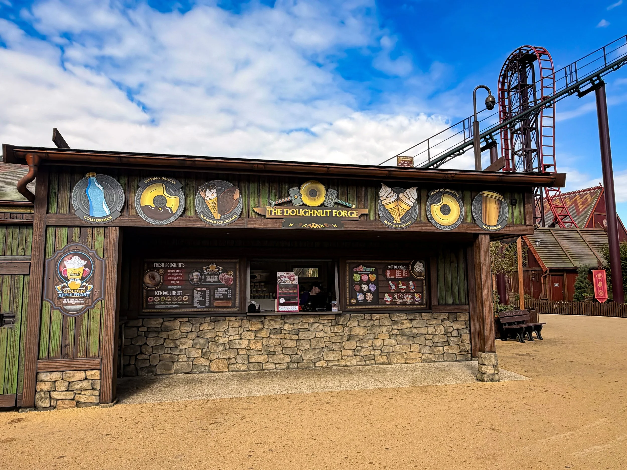
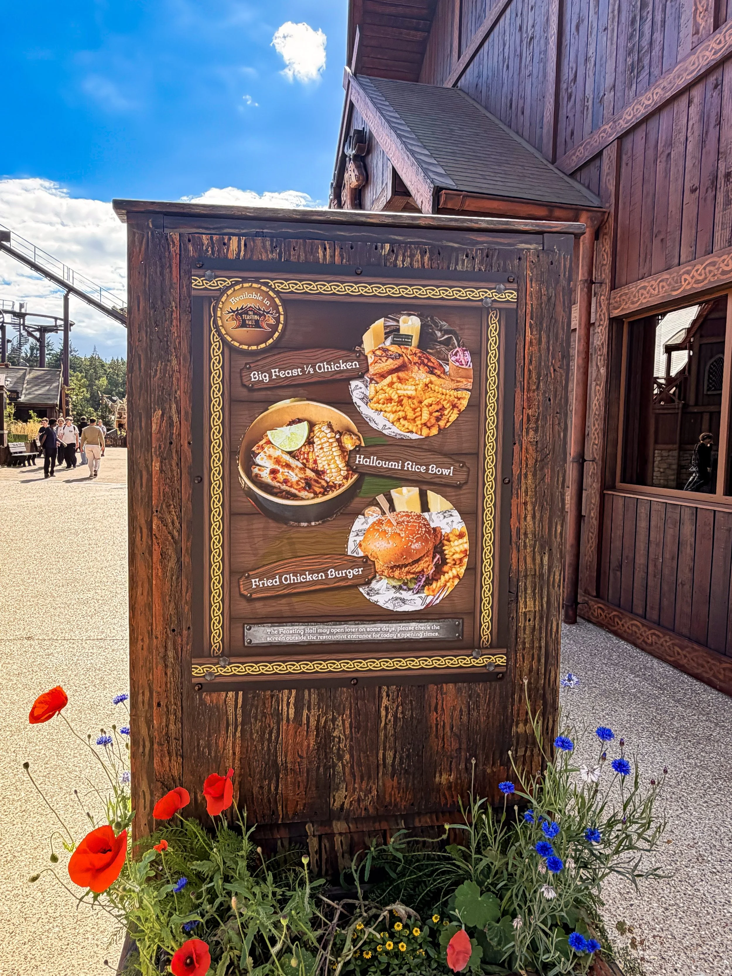
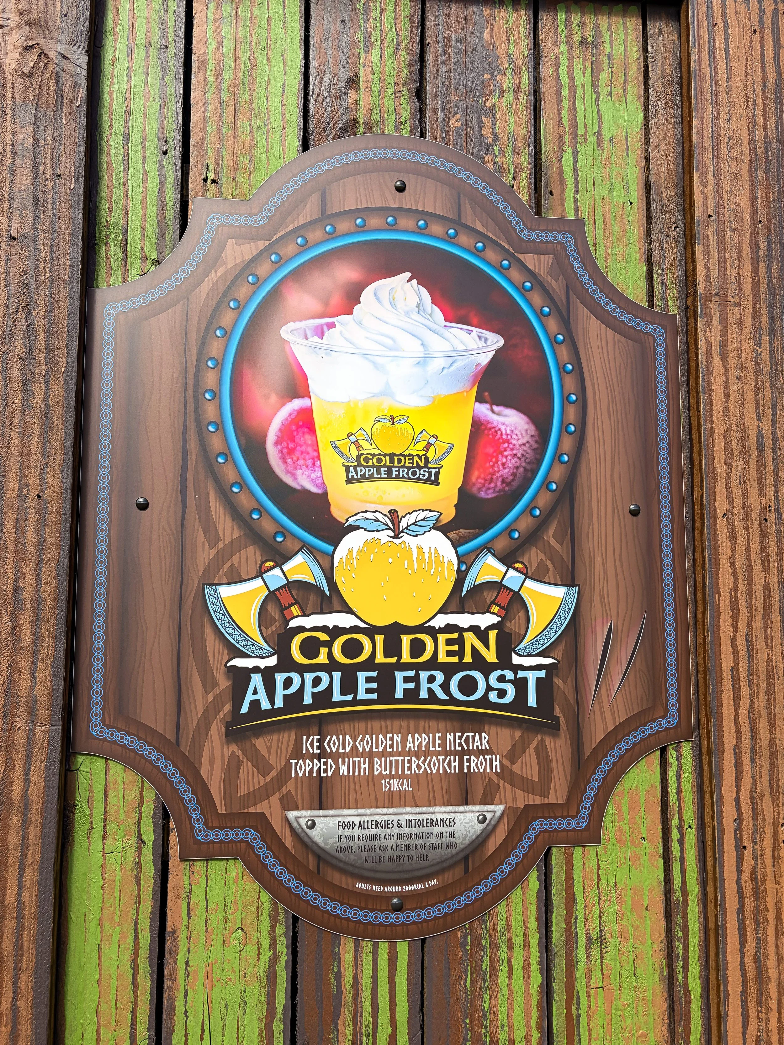
As part of the development of Valgard: Realm of the Vikings, I was involved in the branding of The Feasting Hall, Paultons Park’s Viking-themed dining hall. My work included the logo, menu designs, takeaway food boxes and cups, operational signage, digital menu screens and supporting graphics. I also assisted with photography and created the branding for the bespoke signature drink, Golden Apple Frost.
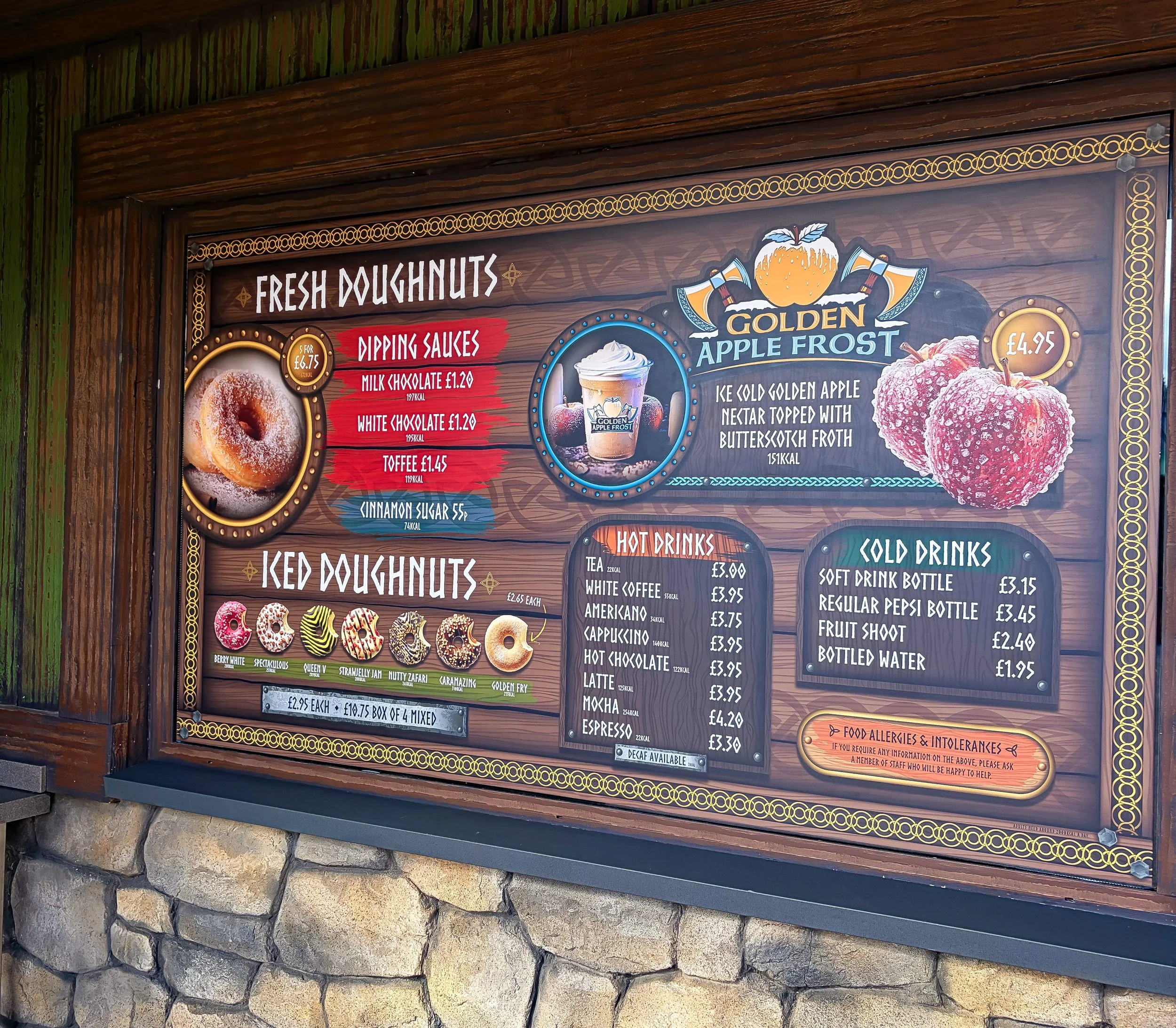
Within the same themed land, I also developed the branding for The Doughnut Forge, including its logo, menu signage and themed graphics, ensuring both outlets felt like natural extensions of the wider Valgard environment.
wild forest
For Wild Forest, a family-friendly restaurant, I designed the menus, digital menu screens and outdoor promotional signage. The menu incorporates a games sheet aimed at younger guests, so the design needed to maintain a playful, accessible feel while clearly communicating the food offering.
route 83 diner
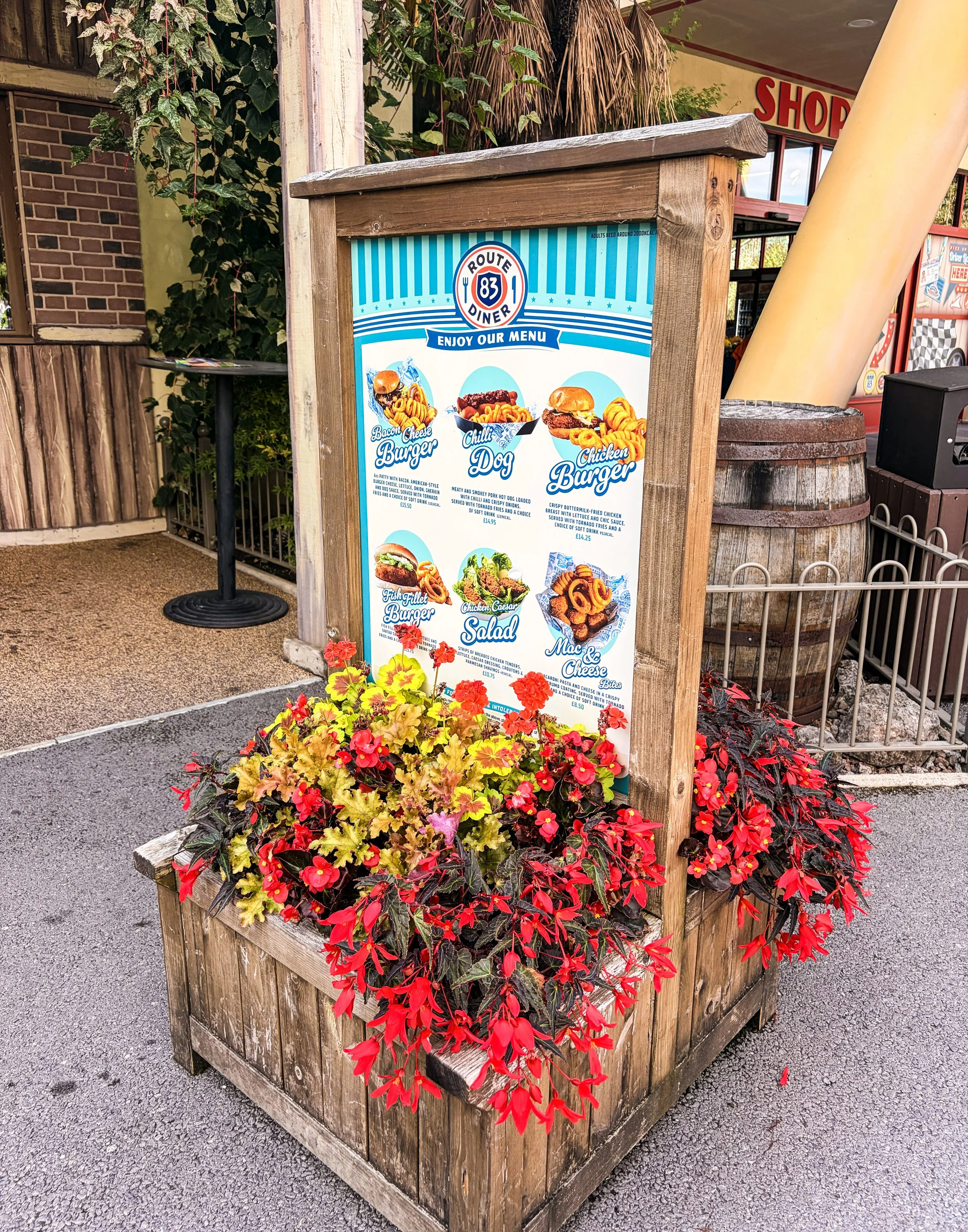
Located within Paultons Park’s 1950s-inspired Route 83 area, I designed the menus for Route 83 Diner, alongside the digital menu screens, operational signage and outdoor promotional graphics. The designs were developed to complement the retro Western aesthetic of the surrounding themed land while remaining clear and functional for guests.grande central
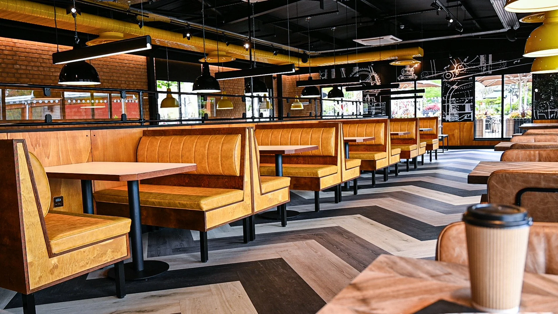
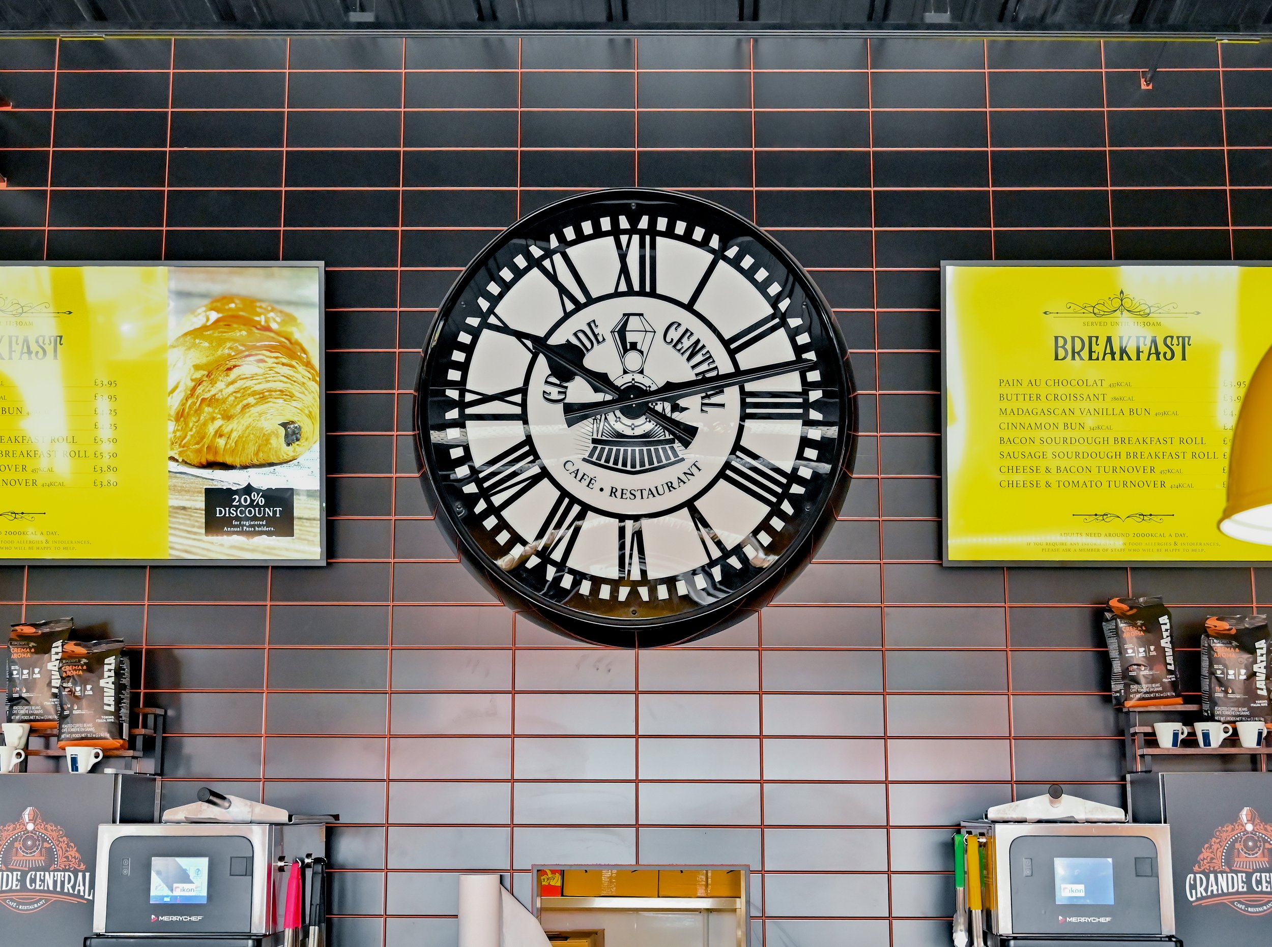
I was responsible for creating the brand for Grande Central, one of Paultons Park’s café/restaurants. The project included the development of the logo and wider visual identity, alongside interior wallpaper design, digital menu screens and menu signage.
churros
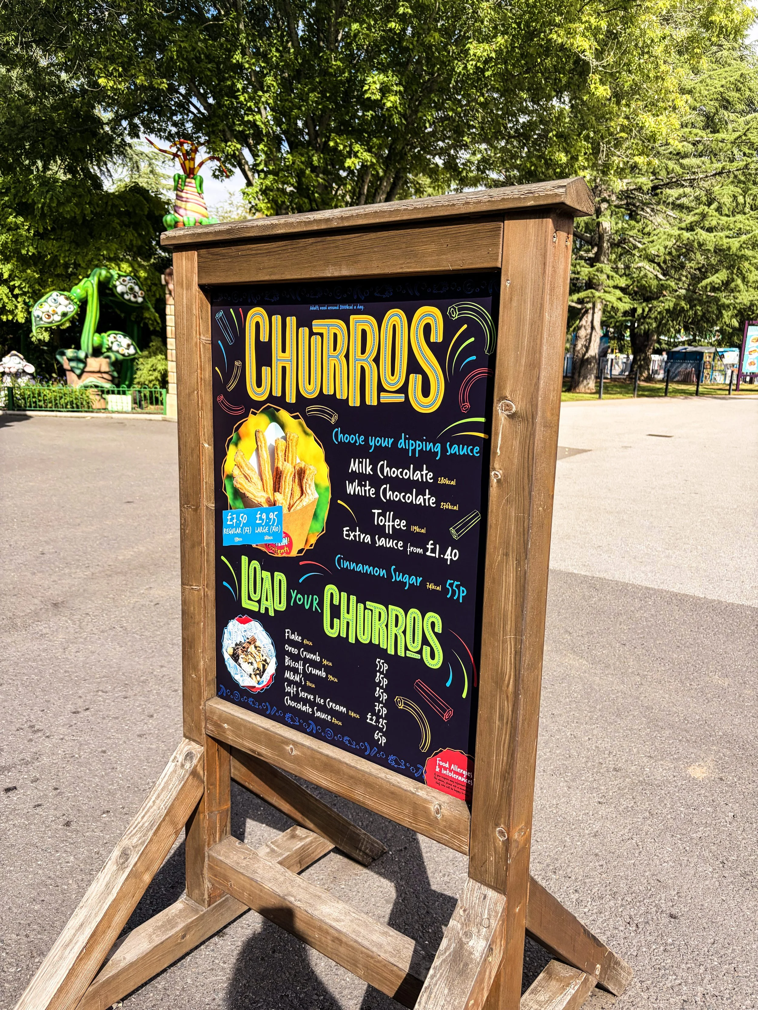
I designed the logo and visual identity for Churros, a small catering kiosk. The new identity uses a bright and playful colour palette, a characterful Spanish-style bull illustration and a collection of quirky supporting graphics.
ciao bella
For Ciao Bella, a smaller Italian-inspired gelato kiosk, I designed the logo and was heavily involved in developing the wider brand identity and building aesthetic. This extended across digital menu screens, external theming and promotional signage.
dino dogs
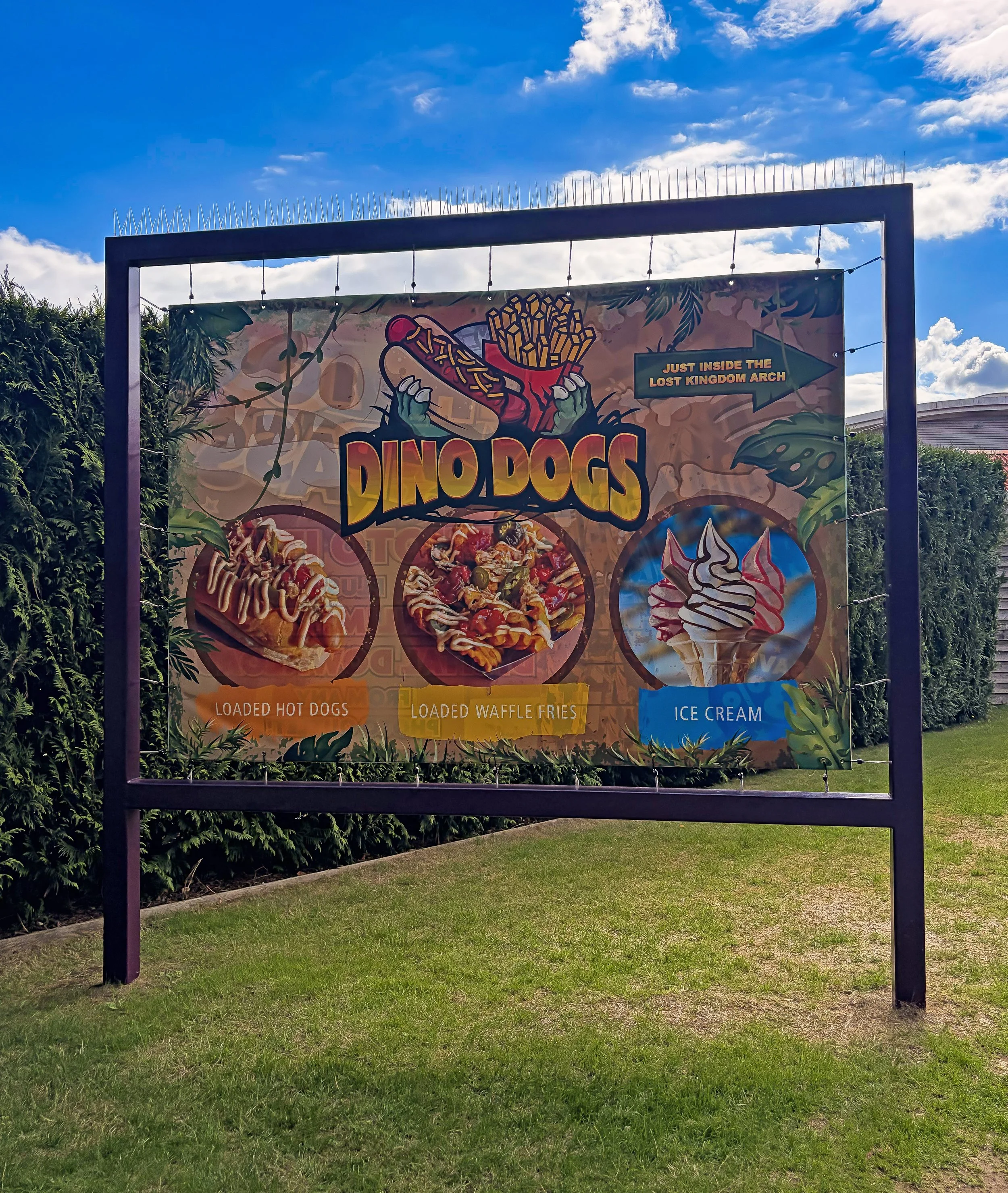
I designed the logo for the rebrand of Dino Dogs, a food kiosk located within the Jurassic-themed Lost Kingdom area. The identity needed to clearly communicate the outlet’s food offering while fitting naturally within the established visual language of the Jurassic environment.
hay barn
I was also involved in the re-theme of Hay Barn, an existing Paultons Park food and beverage outlet that was incorporated into the development of Tornado Springs. With the outlet specialising in Mexican-inspired food, the new branding was developed to reflect the colourful, Western-inspired character of the land.
As part of the project, I worked on menu boards, digital menu screens and large-scale external wooden signage, helping to clearly communicate the food offering while ensuring the building felt fully integrated into the wider Tornado Springs environment.